Psychedelic-assisted therapy is at a unique crossroads—powerful change in a highly scrutinized field. To be taken seriously in this space Therapsych’s brand must bridge the gap between possibility and professionalism.
THE CHALLENGE TO ADDRESS
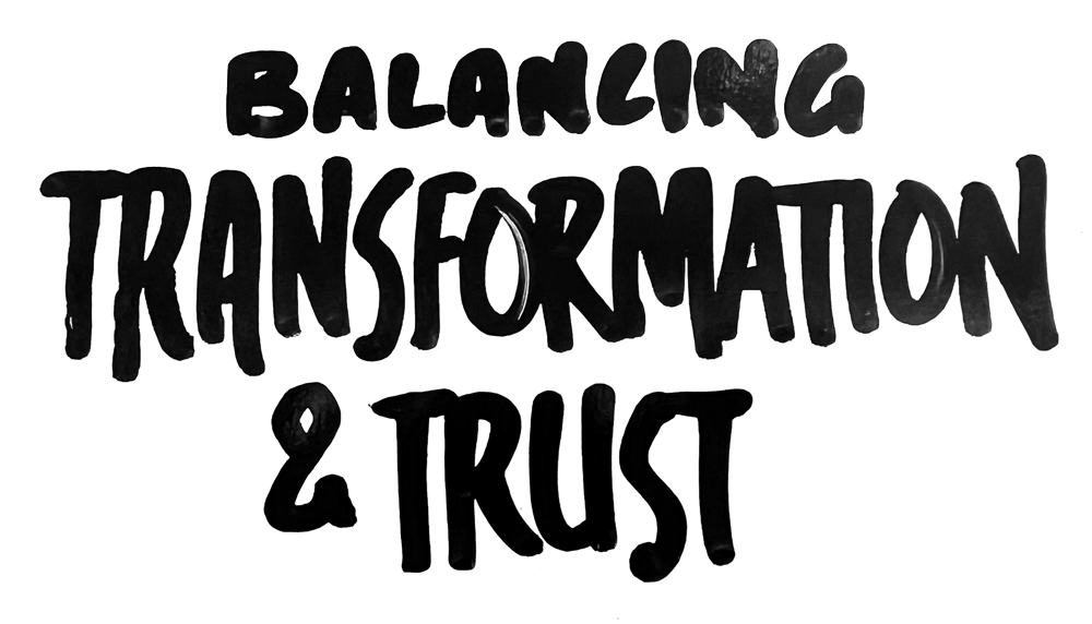
For TheraPsych to successfully balance its brand, the tone and visuals must position it as rooted responsibly in ethics and science, while staying true to the human impact and spirit that beats the heart of the board members building it.
Perception of psychedelics is split:
Many know it as a life-changing intervention with immense medical promise.
Many know it merely as a wild symbol of counterculture and recreational use.
THE BOOBY TRAP TO AVOID
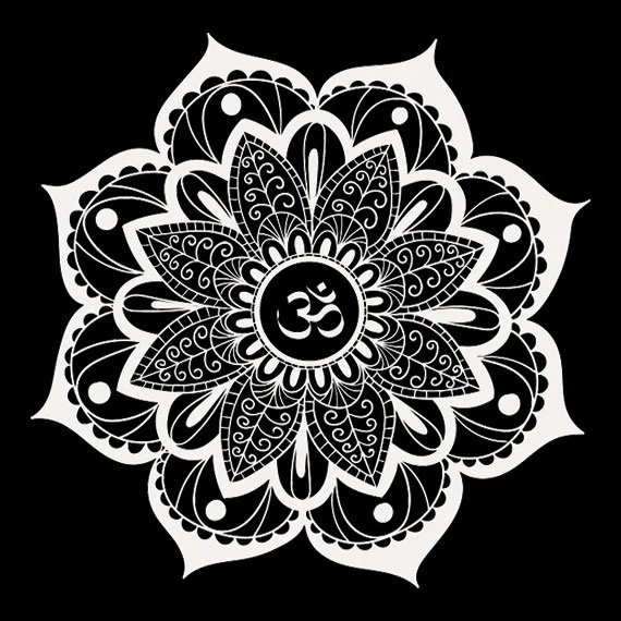
Without a guiding strategy, a love-driven team of psychedelic-aware facilitators will create a brand that looks and sounds like a psychedelic facilitator. Therapsych is building something beyond facilitation, and can demonstrate that by avoiding clichés associated with the space.
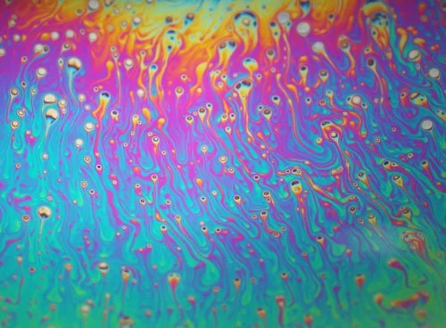
The Visual and Verbal Choices of facilitators often leans toward:
Lovingly Spiritual (near-Shamanic) Symbolism
Gaia-centric Visuals
Countercultural, bright-spectrum swirled color palettes
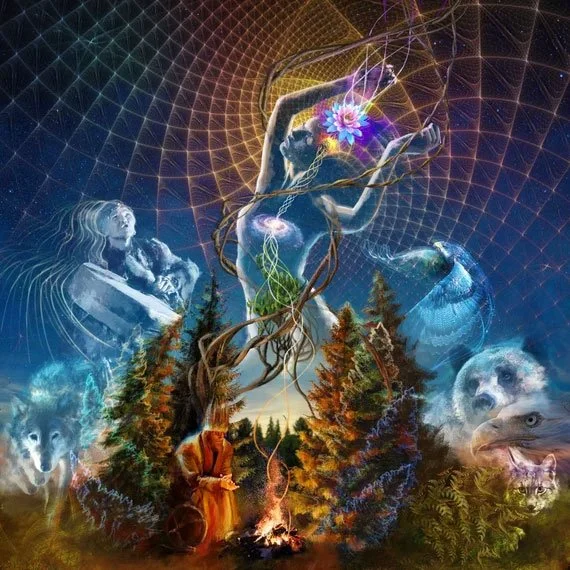


These are beautiful visuals expressing beautiful truths…well-chosen for soul-rich facilitators on the board. And for the larger, group goals of Therapsych, they are too small.
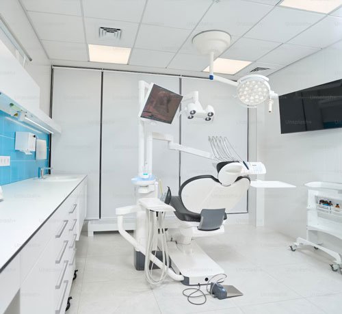
BUT “PROFESSIONAL” CANNOT BE COLD AND CLINICAL
And it is obvious that the vital trustworthiness of Therapsych must avoid the over-serious coldness of a medical clinic. Therapsych can feel scientific without feeling like you're sitting on the sterile paper of an exam table.


THE THEMES TO EVOKE
Warmhearted
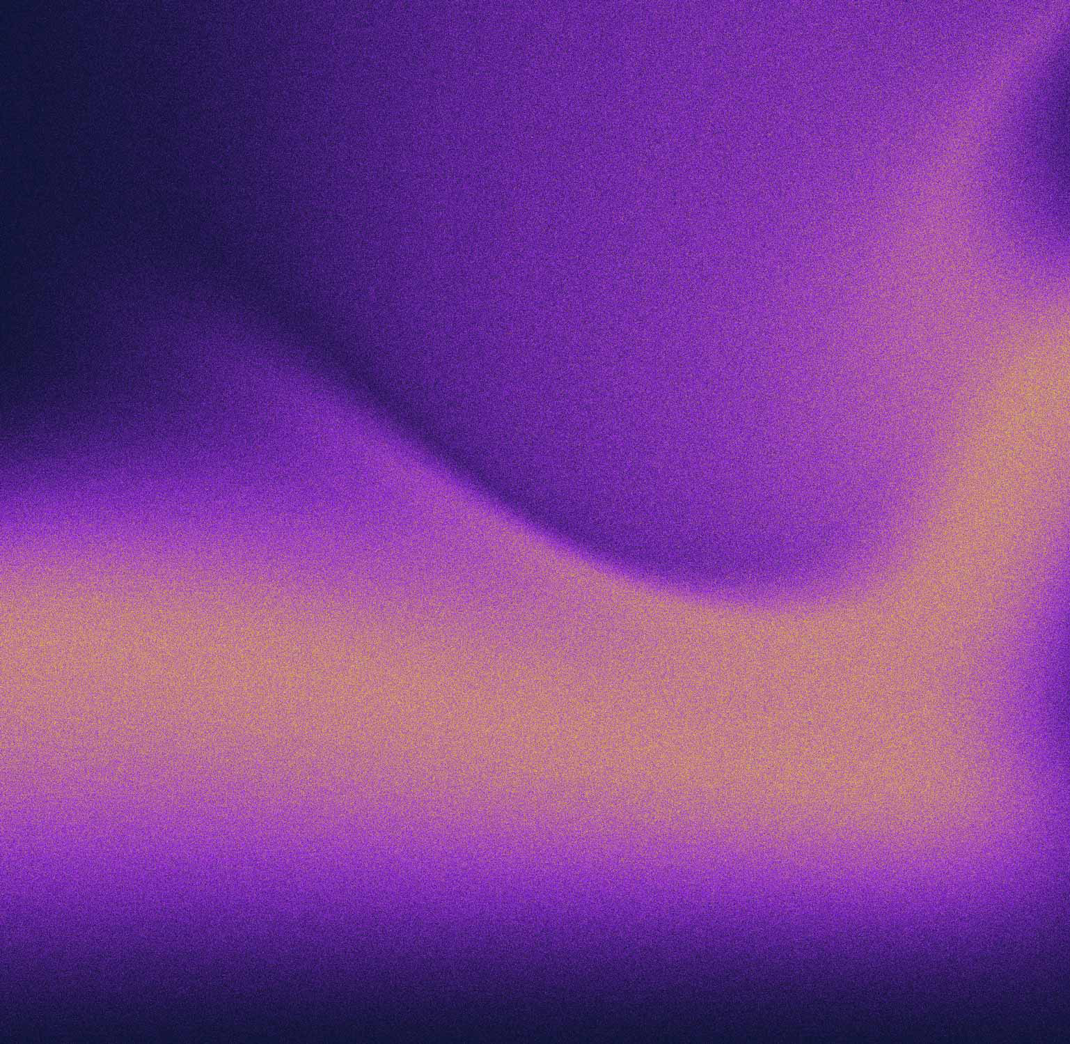
We can support the fantastic mystical colors of the current brand with warm sun-kissed tones.
Professional
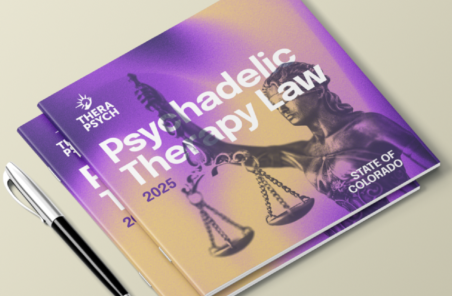
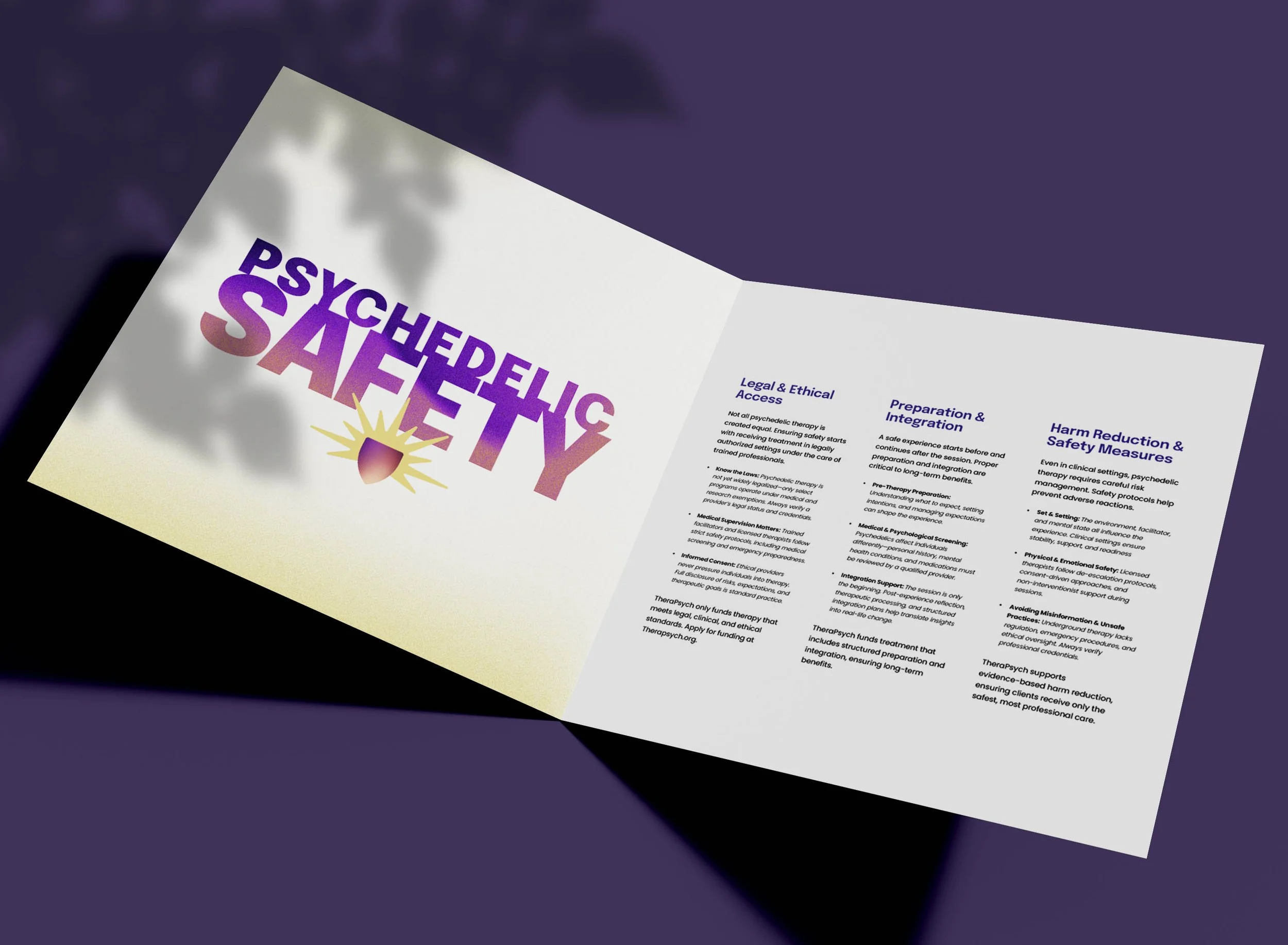
We can focus our language choices on the importance of legality and a safety-first mindset.
Transformation
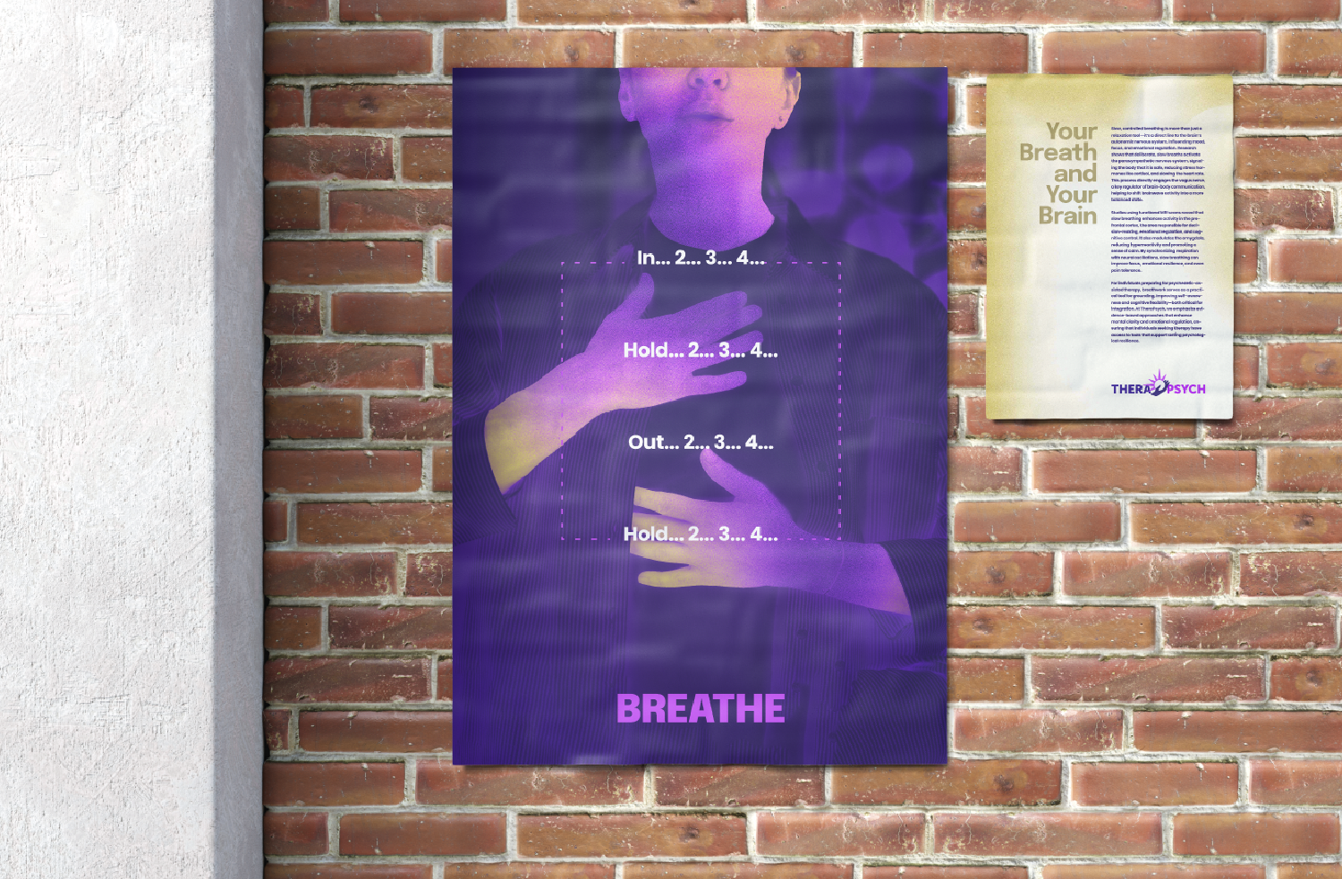
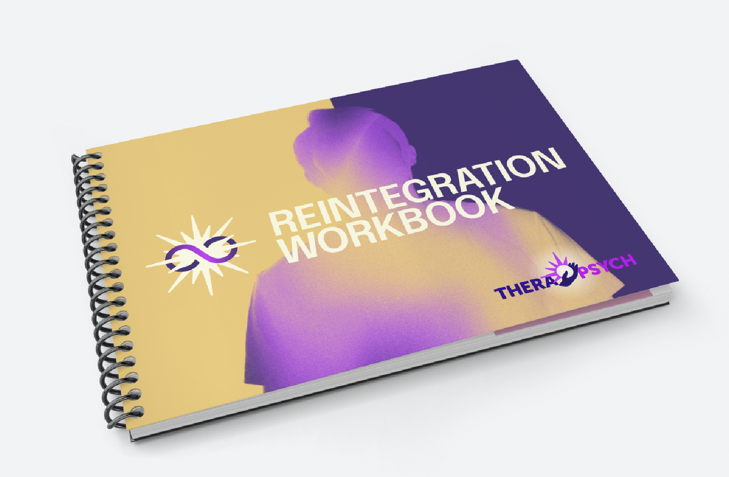
We can introduce a visual system of imagery that uses subtle textured movement, without getting “trippy.”
THE SYMBOLS TO EMPOWER
The Hand
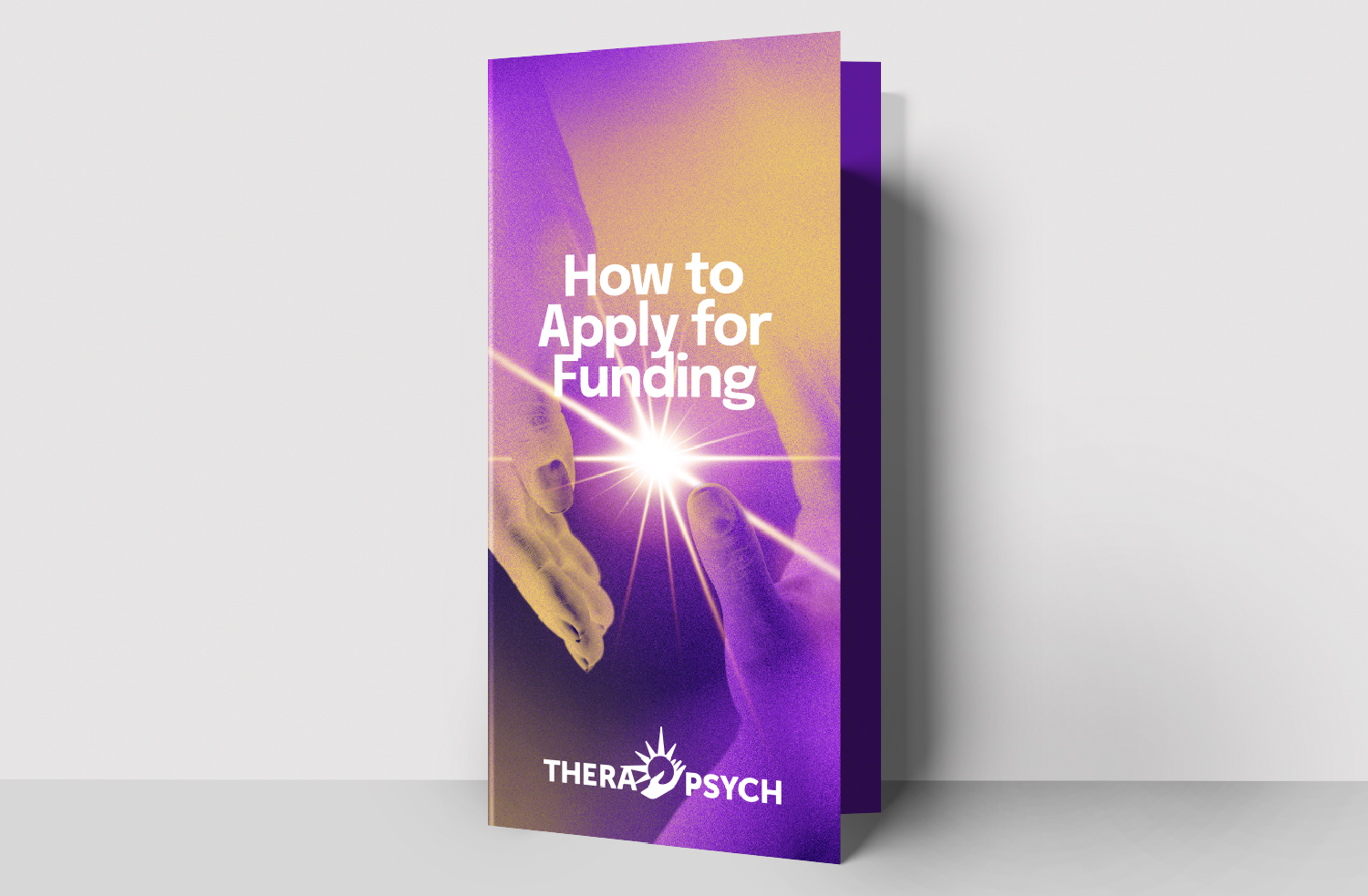
& The Light
The Hand connects effortlessly to the nature of Therapsych. It is practical without being a tool, human without being over-spiritual. It gives. It receives.
The Light is a powerful radiating symbol that brings warmth and transformation. It is a universal element of the psychedelic journey deeper than any one medicine’s more plant-rich symbol system. In solar expressions, it is round and a “hub” without being a disk or a wheel.
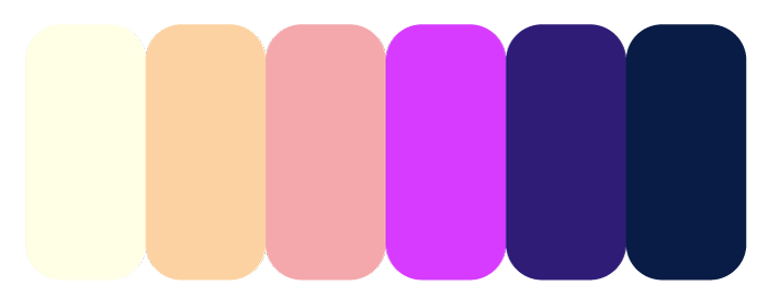
COLOR TO BUILD UPON
Therapsych’s current brand colors are excellent. Hinting at the powerful mystery through purple, and the bright energy through magenta. These can be supported by a golden warmth and a balancing navy blue for depth.
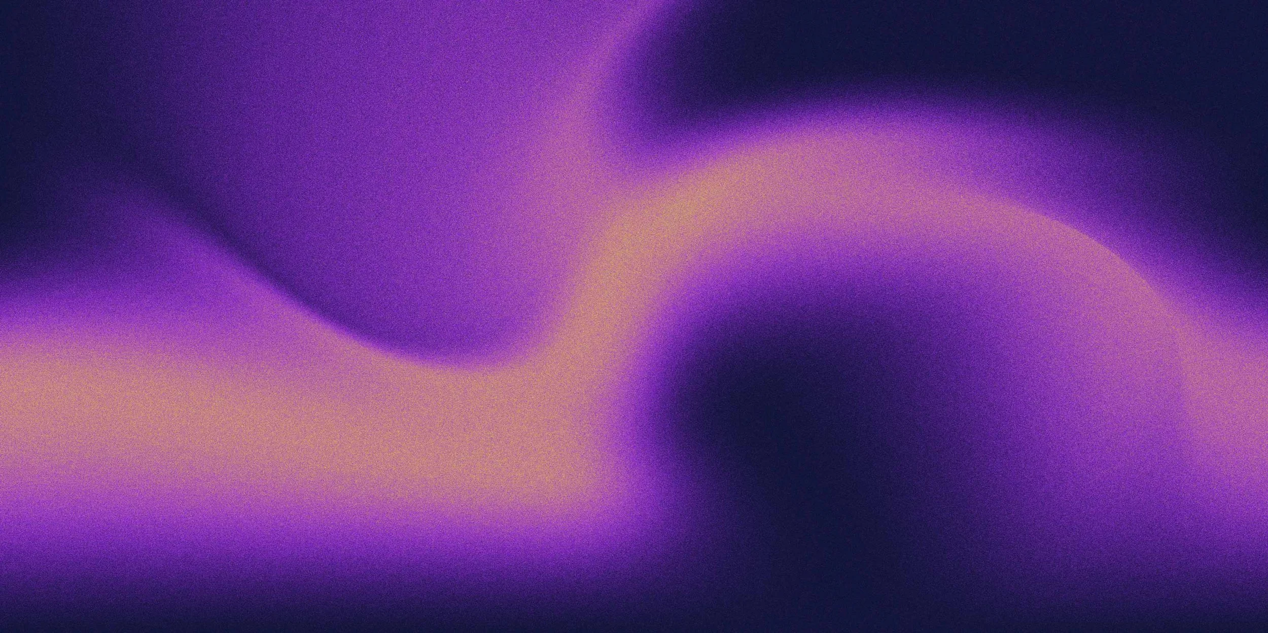
EVOCATIVE MOVEMENT WITH SOFT TEXTURES
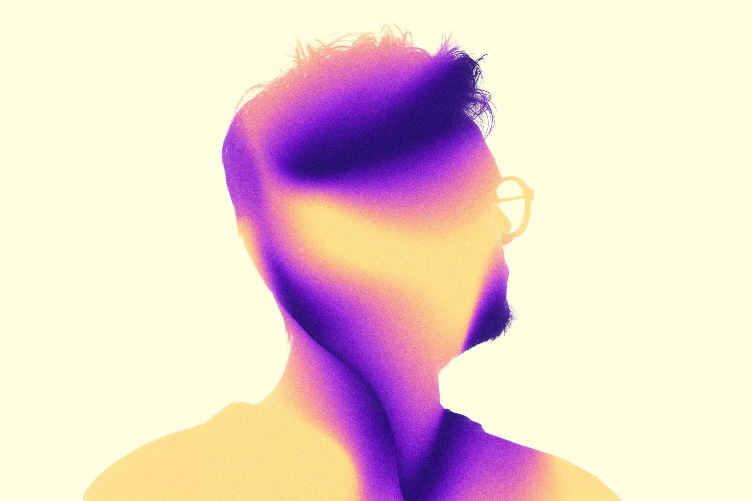
We can still signal the flow-and-color-rich experience of psychedelic influence without becoming trippy. Adding a slight grain to images and backgrounds adds a depth and texture to avoid feeling too slick, and remaining comforting.
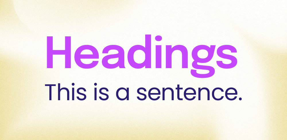
FONTS THAT FEEL MODERN AND HUMAN
Headings use Epilogue – a humanist sans serif that brings a touch of futurism to certain letterforms.
Sentences use Poppins – a wide, friendly, and very easy-to-read typeface that pairs well with the headers.
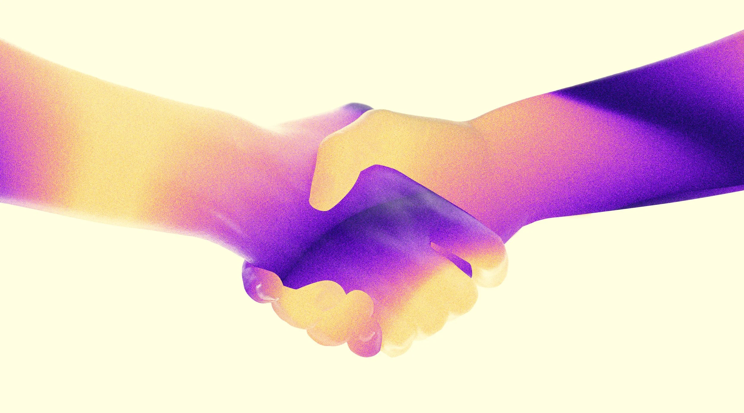
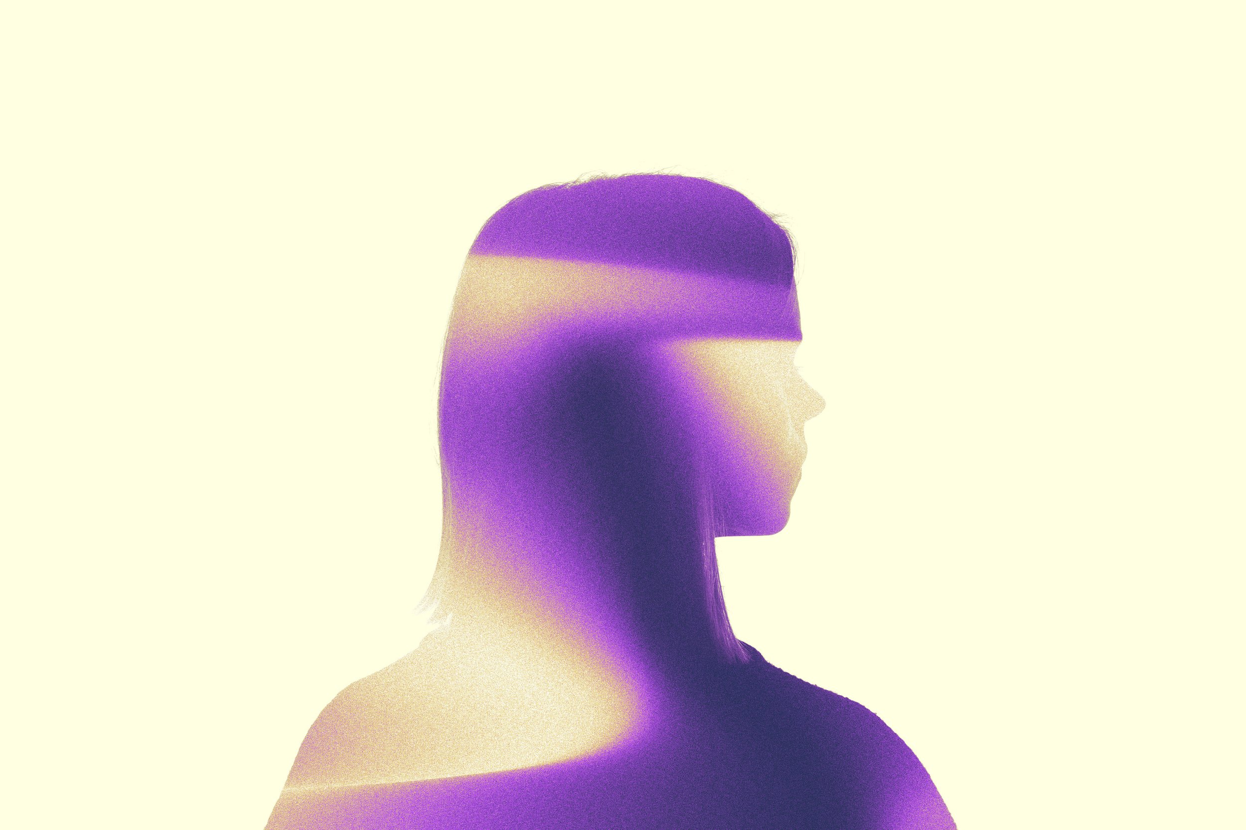
THE POWER OF SILHOUETTE
Images can be adjusted to feel completely unique to Therapsych and not like they’ve come from just-another-stock-photo library. This also allows us to avoid the difficult problems of demonstrating humanity without looking “smile-at-the-camera” cheesy. Silhouette is powerful.
WITH A CLEAN, MEMORABLE ICON OF THE GIFT OF TRANSFORMATION
All of this combining to create visual impressions of:
Warmhearted • Professional • Transformation
THIS BRAND BROUGHT TO LIFE: